
User experience (UX) is a fine art and many developers fail at it. Years ago I watched a basic UX course on PluralSight by Billy Hollis. Since that time I have tried to focus on UX. One thing I’ve learned over the years is how awful modal confirmations are for delete operations. Today we’ll look at another way to approach delete actions by introducing a delayed cancelable action button in React.
Code for today’s post is located on this codesandbox project.
Background
I’ve recently been creating a new “intranet” application that will eventually replace a WPF/WinForms hybrid rich client. This application, by necessity, will ultimately control all aspects of the business.
If there is one thing I’ve learned is how much users hate popups in general, but especially confirmations. “Of course I want to delete it, why else would I click the dang thing!?” is a phrase we frequently utter in frustration. For single items this isn’t terribly inconvenient but pretend you have a large list of items that will be modified.
There are multiple ways to skin that cat, of course, but we’re looking at singular items one-by-one. Each item I click after the previous my frustration level increases. By the end I want to throw the computer, smash the keyboard, spew curses upon the lives of the developer and their family, etc. Oh, that’s just me?
Our job as developers inevitably deals with UX. Maybe you backend guys not so much (though APIs… man… those are still a UX concern, trust me). The rest of us though we have a responsibility to the consumers of our applications. How do we resolve this click-frustration?
Proposed Solution
Well now, allow me to propose one potential solution. In the rich client we’re replacing we started switching delete buttons out to a button that would delay the desired action. Upon clicking it would change to a progress timer with a “cancel” button. You could let the time expire and fire the desired action or you could have an “oh crap!” moment and cancel that thing you didn’t mean to.
This subtle change has two effects:
- 1) I can queue up multiple operations simultaneously
- 2) The UX isn’t preventing me from completing tasks
Given this approach works so well in our rich client, we decided to carry the idea forward into our intranet application.
Getting Started
I’m pretending you have ran create-react-app already and that your application is running "react-scripts": "^2.0.3". This requirement is more so we can automatically include SCSS support than anything else. I’m using the Create React Sandbox template from codesandbox.io to generate my project. Let’s add the following packages to package.json:
  "dependencies": {
    "@fortawesome/fontawesome-svg-core": "1.2.14",
    "@fortawesome/free-brands-svg-icons": "5.7.1",
    "@fortawesome/free-regular-svg-icons": "5.7.1",
    "@fortawesome/free-solid-svg-icons": "5.7.1",
    "@fortawesome/react-fontawesome": "0.1.4",
    "bootstrap": "4.2.1",
    "debug": "4.1.1",
    "react": "16.8.0",
    "react-circular-progressbar": "1.0.0",
    "react-dom": "16.8.0",
    "react-scripts": "2.0.3"
  },
To explain. We’re going to use Bootstrap in my demo and I’m setting up some default classes on the button with it. Feel free to not install it. FontAwesome is how I’m getting icons onto the button. Again, feel free to not use it. Debug is a utility for writing out debug messages to the console. It works in nodeJS so if you were prerendering your app you might consider it. Again, feel free to not use it. React-Circular-ProgressBar, on the other hand, that’s how we’re going to get our progress magic. There are plenty of alternatives out there, that’s the one I chose for now.
Introducing the Button
Without further ado, how about we start creating some components. I added the components and utility folders to my sandbox. Inside the components folder we’ll start by creating the delayed-action-button.jsx file.
Whoa, I need to step aside for a second. I know that some people suggest React naming should be pascal case for the files. If I end up working somewhere that has that convention I’ll follow it but I have years of experience using other conventions that I’ll continue with thank you very much.
Ok, that aside, let’s stub out another file. We need progress-button.jsx. How about we stub out a couple SCSS files while we’re at it: _DelayedActionButton.scss and _ProgressButton.scss. Convention here is that the underscore marks this as a file that will never be referenced directly but is meant to be imported in another SCSS file.
ProgressButton

Let’s start out with the button that has a progress bar on it. This control is essentially a container that has a button absolutely positioned in the center and a circular progress bar will render around the button. This button will be our “cancel” action in the next component but let’s not get ahead of ourselves. This button has no state of it’s own so we’ll make it a functional component. I’m going basic here, feel free to expand it a bit (like make the stroke color customizable, etc).
import React, { Component } from "react";
import PropTypes from "prop-types";

import CircularProgressbar from "react-circular-progressbar";

const ProgressButton = props => {
  return (
    <div className={`progress-button ${props.cssClass || ""}`}>
      <CircularProgressbar
        percentage={props.percentage}
        styles={{ path: { stroke: "#f88" } }}
      />
      <button
        type="button"
        className="btn bare text-danger"
        onClick={props.onClick}
      >
        {props.children}
      </button>
    </div>
  );
};

ProgressButton.propTypes = {
  onClick: PropTypes.func.isRequired,
  percentage: PropTypes.number
};

ProgressButton.defaultProps = {
  percentage: 0
};

export default ProgressButton;
I also want some default CSS to accompany this and said CSS will be linked into our index.scss. This file is called _ProgressButton.scss. Mileage may vary with the absolute positioning but per the demo, this one works. See below:
.progress-button {
  position: relative;

  > button {
    position: absolute;
    left: calc(50% - 21px);
    top: calc(50% - 19px);
  }
}

.custom-content-progress-bar {
  position: relative;
  width: 100%;
  height: 100%;

  .progress-container {
    position: absolute;
  }

  .content-container {
    position: absolute;
    height: 100%;
    width: 100%;
    display: flex;
    flex-direction: column;
    justify-content: center;
    align-items: center;
  }
}
DelayedActionButton
We now have a button that will update it’s progress and allow us to click it. By itself, however, it really doesn’t do anything. Let’s go ahead and create another component to wrap it. This component is where our magic really happens.
import React, { Component } from "react";
import PropTypes from "prop-types";

import { FontAwesomeIcon } from "@fortawesome/react-fontawesome";
import logger from "debug";

import ProgressButton from "./progress-button";
import { isNullOrUndefined } from "../utility/object-utils";

const classNamesProps = {
  button: PropTypes.string,
  cancelButton: PropTypes.string,
  spinner: PropTypes.string
};

const defaultClassNames = {
  button: "btn btn-primary",
  cancelButton: "btn btn-danger",
  spinner: null
};

const debug = logger("demo");
export class DelayedActionButton extends Component {
  static displayName = DelayedActionButton.name;

  constructor(props) {
    super(props);

    this.state = {
      isActionPending: false,
      percentage: 0
    };
  }

  initializeTimeout() {
    this._timer = setTimeout(() => {
      //debug("delay completed...");
      this.stopTimeout(true);
    }, this.props.delay);
    this._timeElapsed = 0;
    this._interval = setInterval(() => {
      this._timeElapsed += this.props.updateInterval;
      let percentage = Math.round(100 * (this._timeElapsed / this.props.delay));
      //debug(percentage);
      /*debug(
        "delay: %d, elapsed: %d, percentage: %d%%",
        this.props.delay,
        this._timeElapsed,
        percentage
      );*/
      this.setState({ percentage });
    }, 250);
  }

  stopTimeout(performAction = false) {
    this._timeElapsed = 0;
    if (!isNullOrUndefined(this._interval)) clearInterval(this._interval);

    if (!isNullOrUndefined(this._timer)) clearTimeout(this._timer);

    this._interval = null;
    this._timer = null;

    this.setState({ isActionPending: false, percentage: 0 }, () => {
      if (performAction) this.props.action();
    });
  }

  onButtonClicked(event) {
    event.preventDefault();
    event.stopPropagation();
    //debug("delayed action began...");

    this.setState({ isActionPending: true }, this.initializeTimeout.bind(this));
  }

  onCancelClicked(event) {
    //debug("delayed action canceled...");
    this.stopTimeout();
  }

  render() {
    const classNames = Object.assign(
      {},
      defaultClassNames,
      this.props.classNames
    );

    let contents = this.state.isActionPending ? (
      <div className="delayed-action-button">
        <ProgressButton
          percentage={this.state.percentage}
          onClick={this.onCancelClicked.bind(this)}
        >
          <FontAwesomeIcon icon="times-circle" />
        </ProgressButton>
      </div>
    ) : (
      <button
        type="button"
        className={classNames.button}
        onClick={this.onButtonClicked.bind(this)}
      >
        {this.props.children}
      </button>
    );

    return <React.Fragment>{contents}</React.Fragment>;
  }
}

DelayedActionButton.propTypes = {
  classNames: PropTypes.shape(classNamesProps),
  delay: PropTypes.number,
  action: PropTypes.func.isRequired,
  updateInterval: PropTypes.number
};

DelayedActionButton.defaultProps = {
  classNames: defaultClassNames,
  delay: 3000,
  updateInterval: 250
};
Ok, let’s go back and explain a little what we’re doing here. I have a few classNames that I want us to be able to define and some default values for them. Those are in classNamesProps and defaultClassNames respectively.
Next, we have a couple state values this button needs to track. It needs to know what percentage it is currently at (of it’s delay) and whether or not an action is even pending firing. Pretty basic stuff.
Let’s skip to the render() method and then come back for the meat. We will render either our unclicked button (by default) or our ProgressButton. We take in classNames overrides, if any, and apply them to our controls. Again, nothing really ground-breaking.
Magic starts to happen, however, once we click either button. Our “unclicked” state will set up a couple of timers. One is a timeout to represent our entire delay and the other is an interval to update the progress bar. I have found in my particular environment that 250ms works great for an update interval but codesandbox.io seems really “chunky” with pretty much any value I throw at it. Experiment freely but for our purposes today we’ll keep it at 250ms which is the default interval.
Let’s add some CSS to our _DelayedActionButton.scss file. This just ensures it remains the same size as the original button. Quite clearly this isn’t going to match all use-cases so it is good to start with a default but override in other situations as necessary.
.delayed-action-button {
  width: 30px;
  margin: 0 4px;
}
Index.js
I made a couple modifications in my demo application but the primary ones I don’t want to gloss over are that I swapped out index.scss for index.css, inserted import "../node_modules/bootstrap/dist/css/bootstrap.min.css";, and added import "./utility/fontawesome";. Let’s look at fontawesome.js.
// https://fontawesome.com/how-to-use/on-the-web/using-with/react
import { library } from "@fortawesome/fontawesome-svg-core";

import { fab } from "@fortawesome/free-brands-svg-icons";
import { far } from "@fortawesome/free-regular-svg-icons";
import { fas } from "@fortawesome/free-solid-svg-icons";

library.add(fab);
library.add(far);
library.add(fas);
//library.add(faAlicorn);
You by no means have to (and should probably not) add every icon library. Realistically you’d want to build up the library of the icons you are using so you can keep your package sizes down. I just went quick-and-dirty.
Other Files
You may at some point have noticed that our delayed-action-button.jsx file also references object-utils. I’ve previously included this in other blog posts. It just has some friendly utilities to check whether a reference is null or undefined as well as some to check an array or string value. I’m not going into details on it, just know it is there.
My demo also includes a demo-container.jsx and info-marquee.jsx. Both of those are simply for the demo purposes.
Demo
Without further ado, you can open the full codesandbox project or view just a demo window instead. The demo is pretty basic. It contains a single button styled with a trashcan icon from fontawesome. When you click the button it puts a status block up after it completes. Next, it waits a couple seconds and removes the status block.
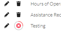
A current implementation I’m working on looks something like this with the buttons:
Conclusion
We’ve looked at one way to address UX-related stress through the use of a delayed cancelable action button. This button allows the end-user to queue up actions without the burden of the GUI preventing them from completing tasks.
The component as presented is still pretty basic. There are probably use-cases where you want to know when the button was initially clicked or canceled. Consider those options to extend the button.
Remember that code for today’s post is located at codesandbox.
Credits
Photo by David Rangel on Unsplash