
Checkboxes are boring. Checkboxes are bland. You have a designer hand over the design for the new website you’re working on and put some pretty checkboxes on there. Sorry man, no can do, you say. Guess what though? You can. In this post we’re going to talk about creating a styled checkbox using React.
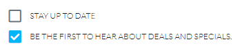
Here is an example of what we might hope to end up with:
All code for this post can be located via this codesandbox project.
Initial Setup
I’m going to make a wild assumption that you know how to set up a React project so let’s just wave our magical wand and pretend you did that.
This particular checkbox is going to be dependent on FontAwesome 5.x and I’m going to use their React components for it. You’ll want to install the following packages: @fortawesome/fontawesome-svg-core, @fortawesome/free-regular-svg-icons, @fortawesome/free-solid-svg-icons, and @fortawesome/react-fontawesome. Yes, that’s kind of a lot.
Alternatively you can simply reference their webfonts CSS. If you do it that way the rest of this post won’t jive so instead you’d follow their documentation.
Getting Started
Ok, now that we have our dependencies set up and our application ready to go first thing we need to do is actually get FontAwesome into our pipeline. In your application entry point (App.js, index.js) we need to add a few lines of code (read more on this here):
import { library } from "@fortawesome/fontawesome-svg-core";
import { faCheckSquare } from "@fortawesome/free-solid-svg-icons";
import { faSquare } from "@fortawesome/free-regular-svg-icons";

library.add(faCheckSquare, faSquare);
This grabs individually the “check-square” and “square” icons from the solid and regular libraries respectively and registers it with our library. Ultimately what this does is it aliases them so I can use check-square or square string values and it’ll map to those respectively. *note* It will always infer you are using the fas prefix (Font Awesome Solid). This becomes important to know later on.
Let’s create a new component called checkbox.js (or jsx) and start piping this in (btw, you can totally do this as a functional (ie stateless) component. My referenced codesandbox project has one but for the sake of this exercise I’m doing it as a full React component):
import * as React from "react";
import { FontAwesomeIcon } from "@fortawesome/react-fontawesome";

export default class CheckBox extends React.Component {
	constructor(props) {
		super(props);
	}

	render() {
		return (
			<div className={`checkbox ${this.props.className || ""}`}>
			</div>
		);
	}
}

CheckBox.propTypes = {
  checked: PropTypes.bool,
  label: PropTypes.string,
  size: PropTypes.oneOf(["", "xs", "sm", "lg", "2x", "3x", "5x", "7x", "10x"])
};

CheckBox.defaultProps = {
  checked: false,
  label: null,
  size: "lg"
};
I’ve set up the developer runtime prop checking and some defaults. Personally I like doing this because it is self-documenting. I based the sizes on FontAwesome sizing and defaulted to lg because I think that looks better. Feel free to disagree.
Making it interesting
So clearly our component is still pretty boring right now. In fact, it doesn’t even look like anything or do anything. That’s more boring than a regular checkbox, isn’t it?
Let’s go ahead and add this.onCheckChanged = this.onCheckChanged.bind(this); to the bottom of the constructor. This is going to map our function and bind the this operator to it so we have access to state. We can do this many other ways, this is my preferred way.
Now add the following method under the constructor:
  onCheckChanged(event) {
    const { checked } = this.props;
    event.stopPropagation();

    if (this.props.onChange !== null && this.props.onChange !== undefined) {
      this.props.onChange({
        name: this.props.name,
        checkState: !checked
      });
    }
  }
We should probably add this into our propTypes and make it isRequired. So… go ahead and add that: onChange: PropTypes.func.isRequired. Ok. Remember that only applies to a development build so it’s not like this will *really* be required. This just helps you as a developer and self-documents your expectations.
Our onChange function is going to handle the check/uncheck and pass the event up to the parent. It’ll simply rely on what the current “checked” status is and then flip the bit. But wait, we haven’t hooked it up to anything. Let’s modify the render statement to look like this:
render() {
const { checked, name, label, classNames, size } = this.props;

const icon = checked ? ["fas", "check-square"] : ["far", "square"];
const classes = Object.assign({}, defaultCssClasses, classNames);

return (
  <div className={`checkbox ${this.props.className || ""}`}>
	<FontAwesomeIcon
	  className={classes.checkBoxClass}
	  icon={icon}
	  onClick={this.onCheckChanged}
	  size={size}
	/>
	{label && (
	  <label
		className={classes.labelClass}
		onClick={this.onCheckChanged}
		dangerouslySetInnerHTML={{ __html: label }}
	  />
	)}
	<input
	  type="checkbox"
	  name={name}
	  checked={checked || false}
	  readOnly
	/>
  </div>
);
}
Ok, what have we done here? First off we’re going to render either the checked version or not depending on if the prop for checked is true. Next we’re going to allow for any CSS class overrides but otherwise want to use our defaults. Lastly, we’re actually rendering the font, label (if any), and a hidden HTML checkbox so a form post containing this will still work correctly. Let’s go over this in finer detail.
Remember earlier when I said that the React FontAwesome will default to use the “solid” fonts? Well, for our “unchecked” state we wanted to use the square from the regular font set. You’ll notice that in our code I ended up passing an array for each font rather than simply the string. This is because I wanted to override the defaults and instruct which font set to use. I didn’t have to pass the array for check-square mind you but did so for consistency sake.
The label, you will notice, only renders if they specified label text for it. I’ve ran into some use-cases where I wanted a label to be rendered outside of the checkbox control. You will see I also instructed it to allow the label content to be HTML and render as such. Feel free to change that.
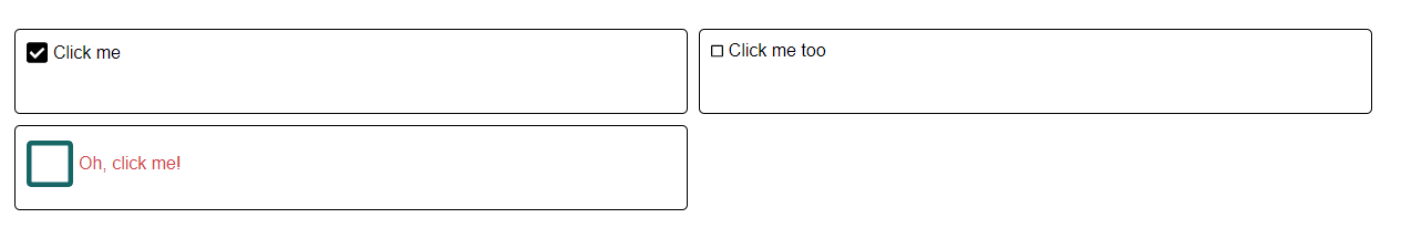
Here are some examples of the checkbox now using different sizes and classes for the checkbox and label:
Conclusion
We now have finished creating a styled checkbox using React. This example is pretty basic and has a lot of room for growth. You might want to extend this to have different CSS for the “checked” and “unchecked”. Maybe you want the hidden input to have an ID attribute on it as well. Perhaps you want to make it so the “checked” and “unchecked” icons can be overridden as well. These are just a few ideas on ways to expand the component.
Credits
Photo by Artem Sapegin on Unsplash